The Circle Medical mobile app
I have led the design of the Circle Medical application for 4 years. In that time, I have led many succesful projects with results like reducing support interactions by over 30%, introducing billing capabilities like insurance and invoicing management, increasing activation rate by 5%, and more. Read on below.
Client
Circle Medical
DELIVERABLES
Research Illustration Designs Loom walkthroughs
Year
2025
Role
Research and Design
Metrics
We track a few key metrics that drive everything we do with the Circle Medical app:
Activation rate - How many patients show up to the appointments they book.
Support interactions - How often patients get in touch with us. This has a direct association to the cost of running our support teams, and is also a trailing indicator of UX issues.
AOC's - How many different areas of care (i.e. annual check-up, hair loss, anxiety) we see an average patient for. Our goal is to provide comprehensive care, so this is a good way of tracking whether we are treating a single patient for all of their preventative health needs.
Research
We combine several methods of research:
Direct patient interviews - Discuss recent appointments and test out prototypes over live video
Unmoderated user tests - Gather larger sets of feedback on prototypes
Behavioural data - Look at large trends and dropoff points with Looker, our BI platform
Patient feedback - Scan large volumes of patient chats to understand where they are experiencing friction
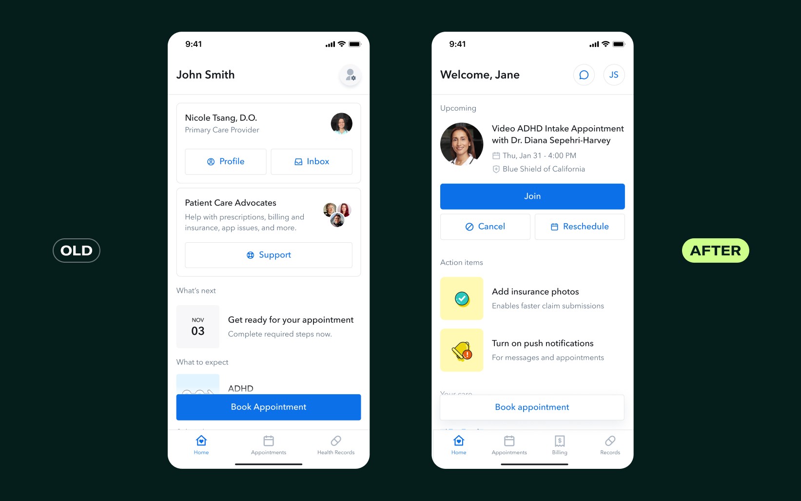
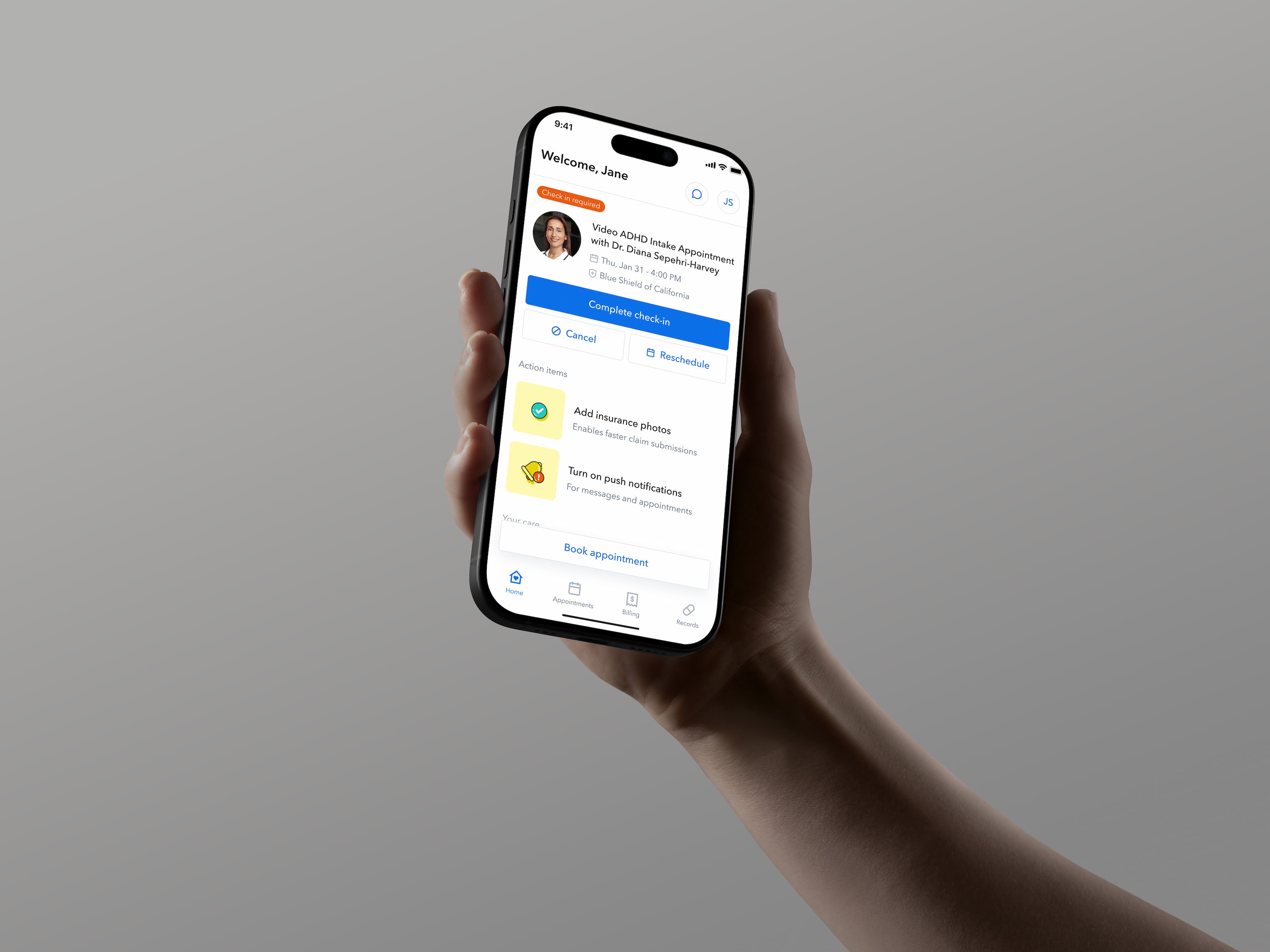
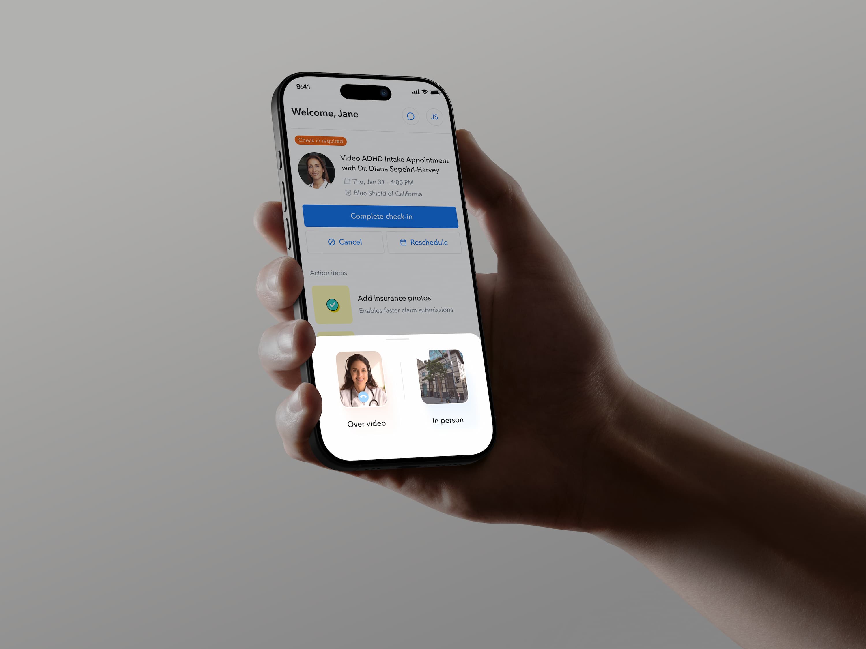
Increased activation
We long operated under the assumption that the #1 most important action for patients was to book appointments. After reviewing Looker data, we realized that over 50% of appointments are actually booked by the provider during a call. As a result, we thought about how we could drive the patient to actually attend those appointments
By changing the primary CTA on the homescreen from booking an appointment to joining an upcoming appointment, we were able to increase our activation rate by 2%, which translates to many thousands of appointments per year. We also avoided any decrease in patient-initiated bookings, telling us that the book appointment flows are still discoverable.
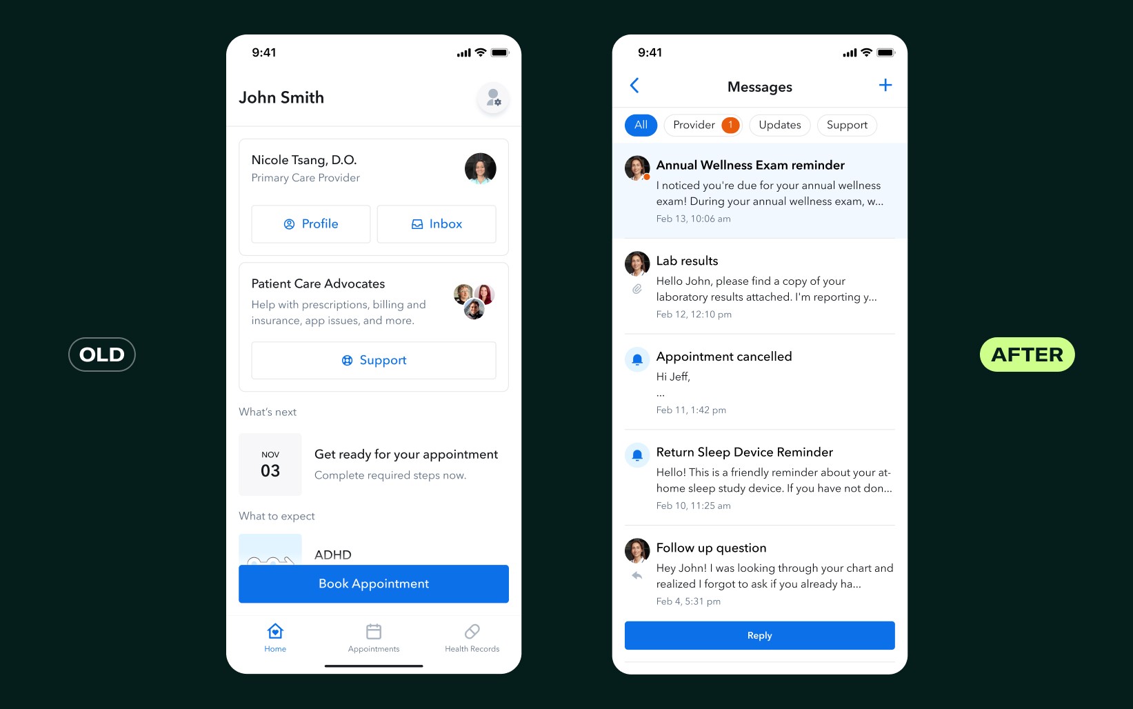
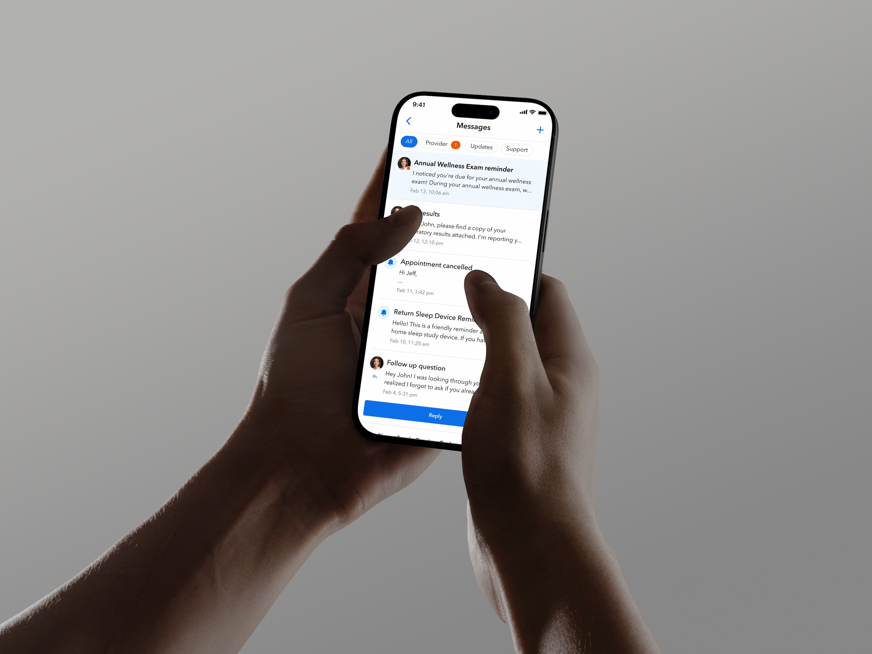
Reduced support costs
For a long time, Circle Medical considered messaging with a provider or support a critical function - and the UI represented this by placing both of those inboxes front and center on the homepage. Based on repeated customer feedback and consistently raising support volume, this caused a few issues:
Patients were confused about which inbox to use for any given issue
Going to support was a first resort because of how it was treated in the interface
To remedy this, I designed a single messaging center, containing both support and provider messages that lives in the nav bar of the app. There was concern that this would make it more difficult to find support and therefore resolve issues, but early user tests indicated that this would not be an issue. After 1 month of A/B testing, we noticed the following:
Zero impact on NPS, indicating patients were experiencing the same ease of resolving issues
30% reduction in support costs, which amounts to almost $1.5 million every year
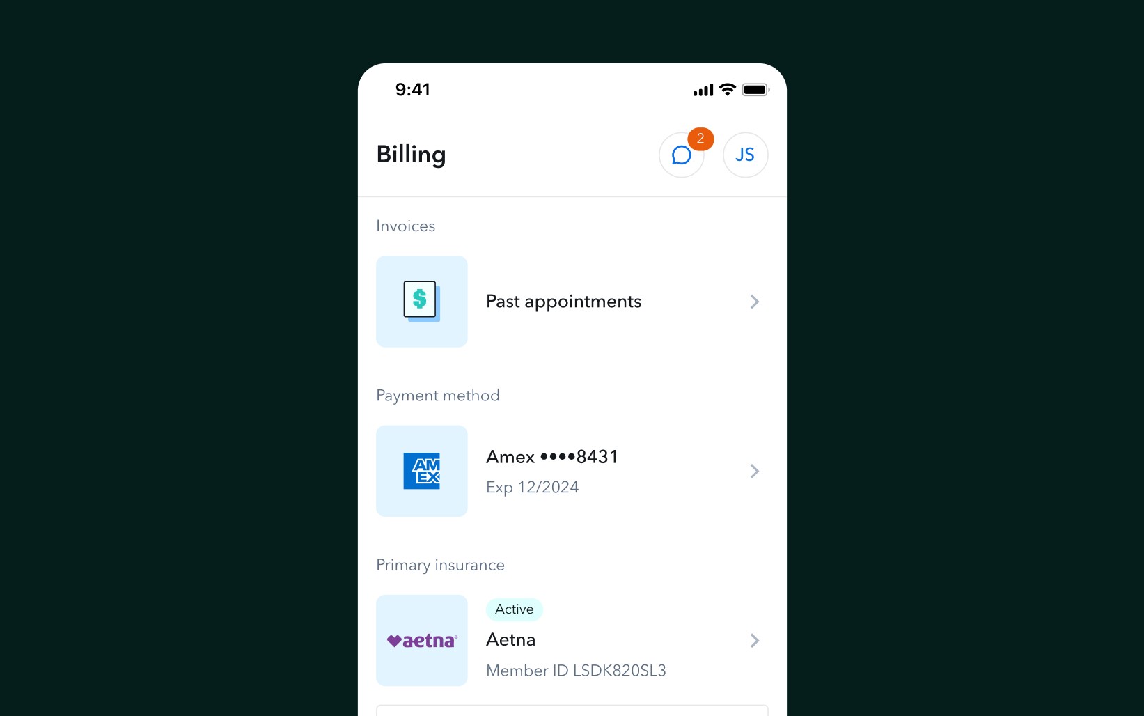
Self serve billing
The three top reasons patients open the Circle Medical app are to:
Attend and book appointments
Write or respond to messages, either from support or providers
Billing tasks, like paying invoices or updating insurance
Traditionally, billing functionality was extremely limited and relegated to the account screen. Patients rarely visited that screen but frequently chatted in about billing issues, indicating a discoverability problem. I designed a dedicated billing tab where patients can update payment methods, download and pay invoices, and manage their insurance.